FEEDING AMERICA CONCEPT
INTERBRAND / FEEDING AMERICA RE-NAMING & BRAND CONCEPT
Client: Interbrand Creative Director: Loid Der Design Team: Eva Reese, August Heffner
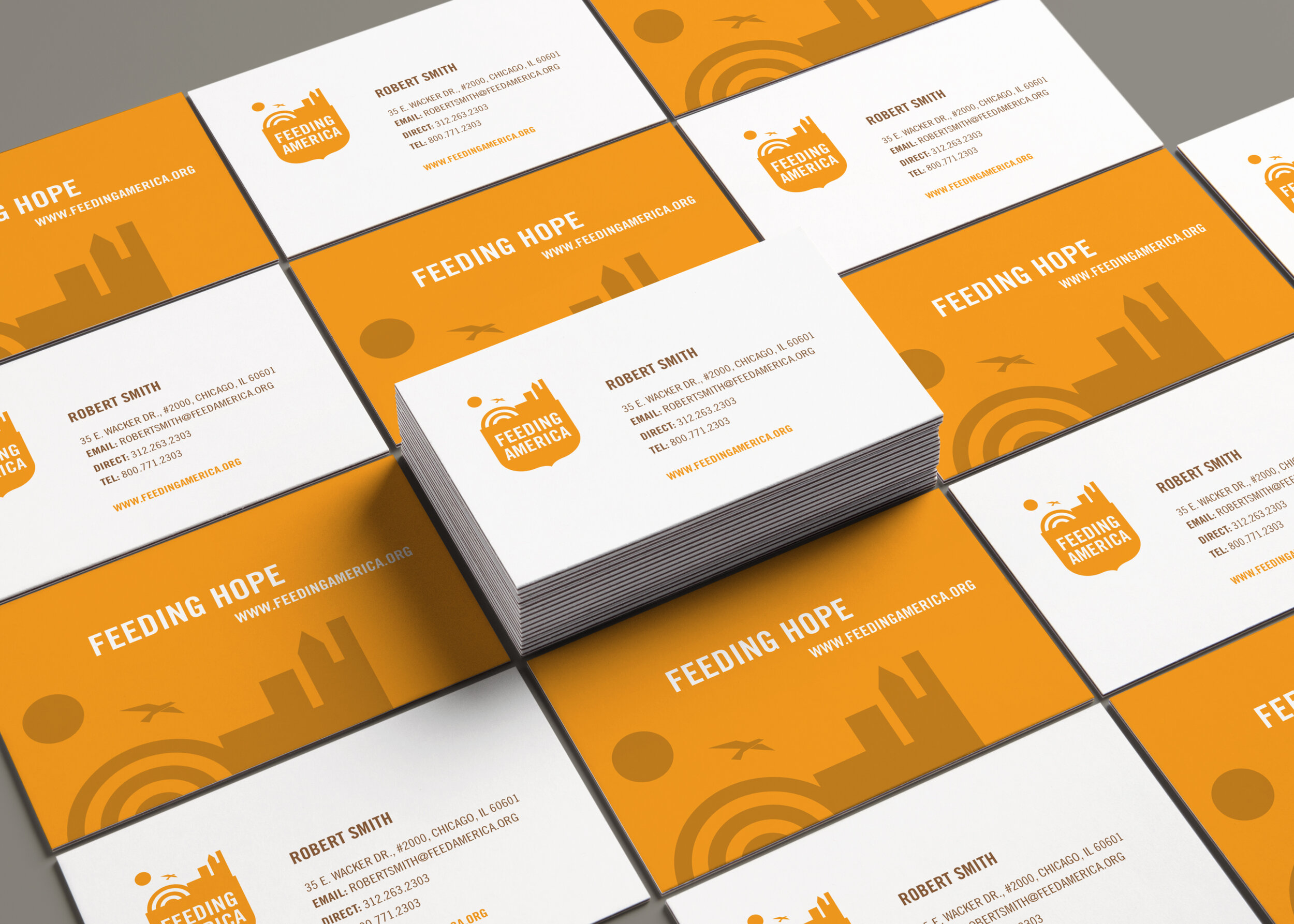
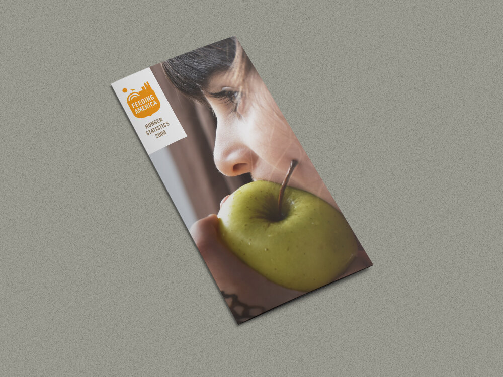
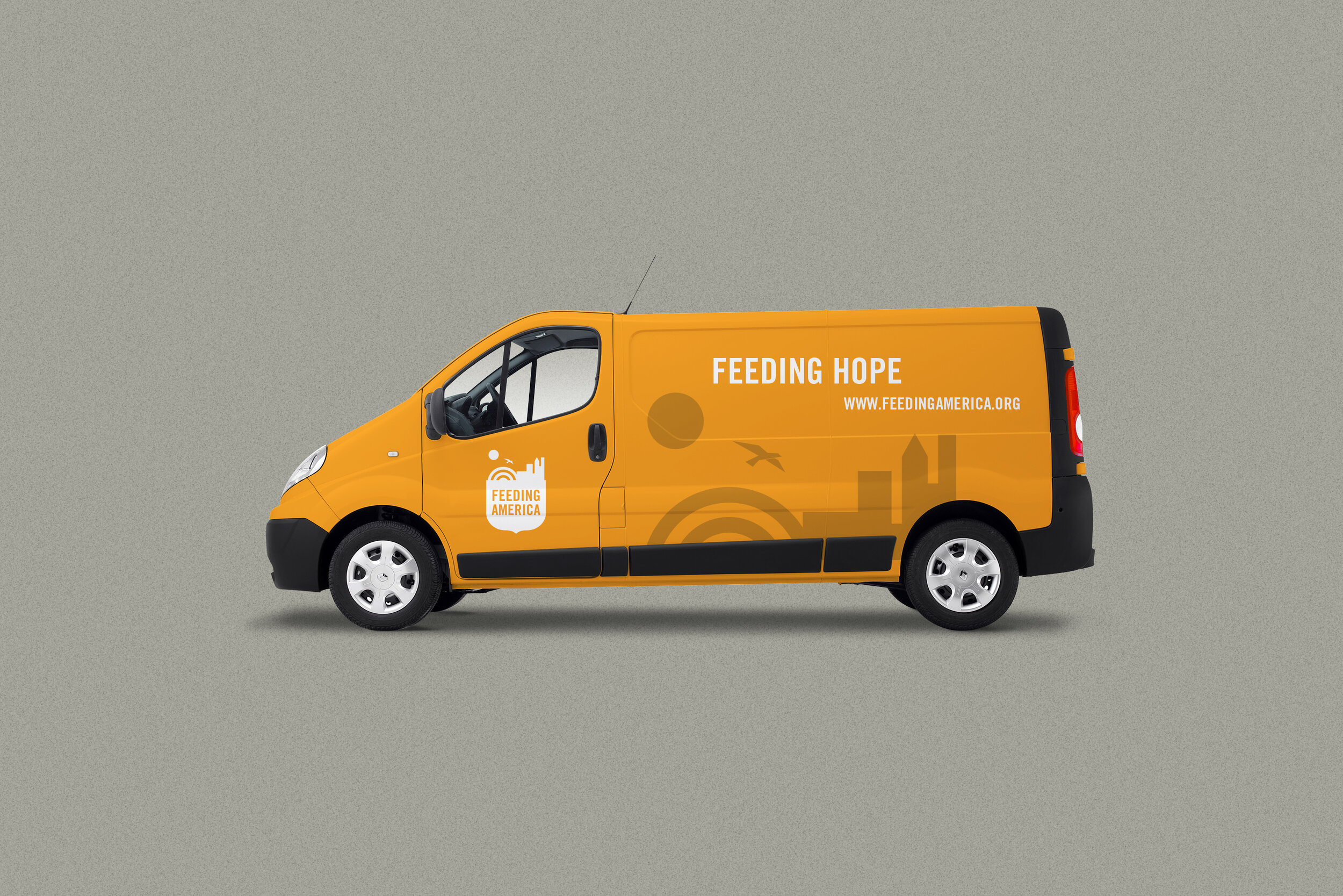
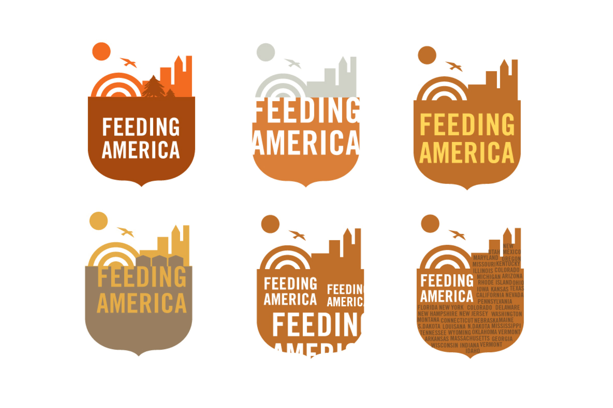
This concept, although not chosen, emphasizes Feeding America’s servicing of both rural and urban communities across the country. The logo I created with a raised sun, rainbow and soaring bird suggest a feeling of hope. A raised sun, rainbow and soaring bird also suggests a feeling of hope. The words FEEDING AMERICA rests on top of a seal that supports the growth and need of the mission.
#cornucopia #sealofapproval #established #vessel


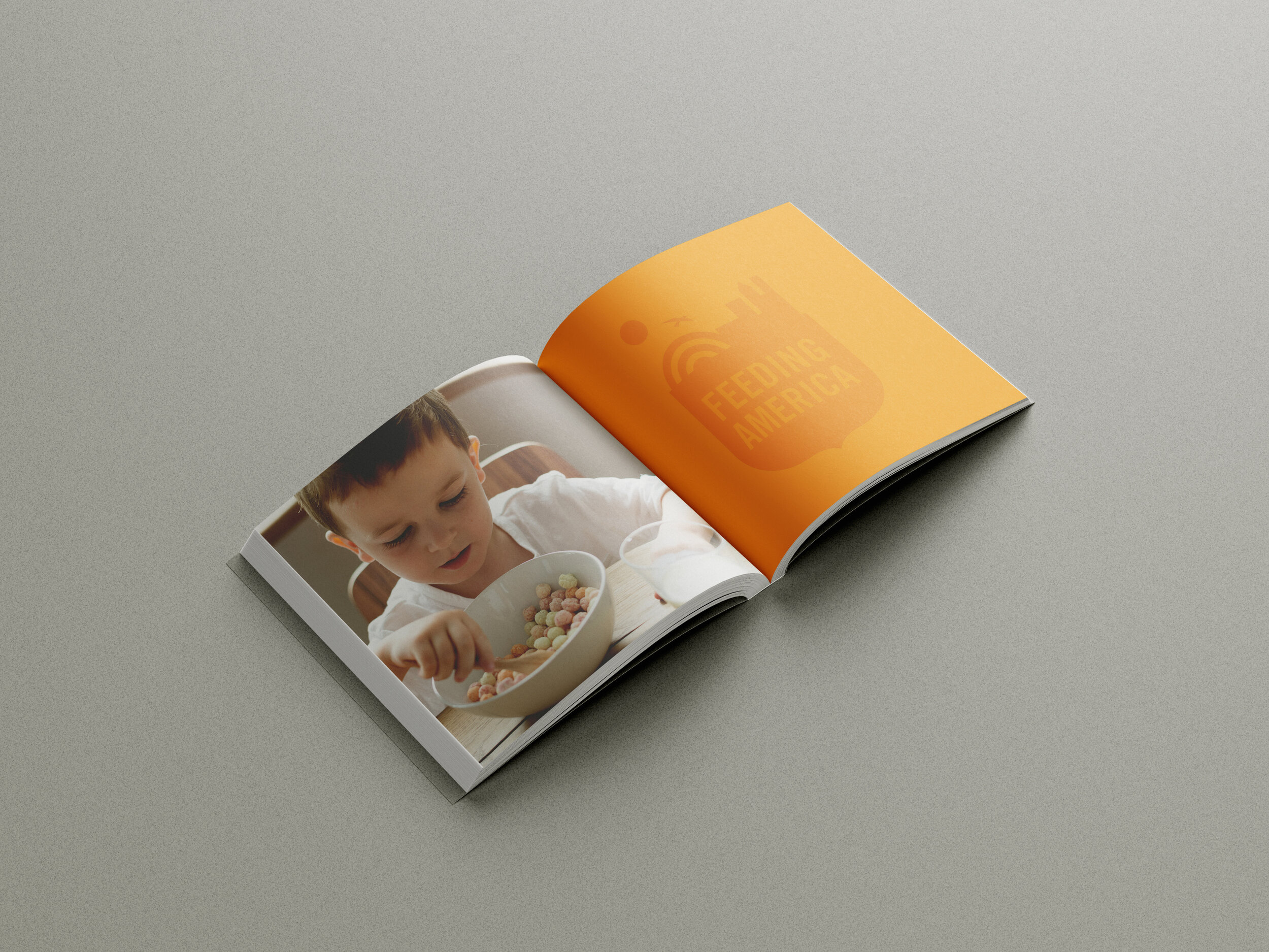
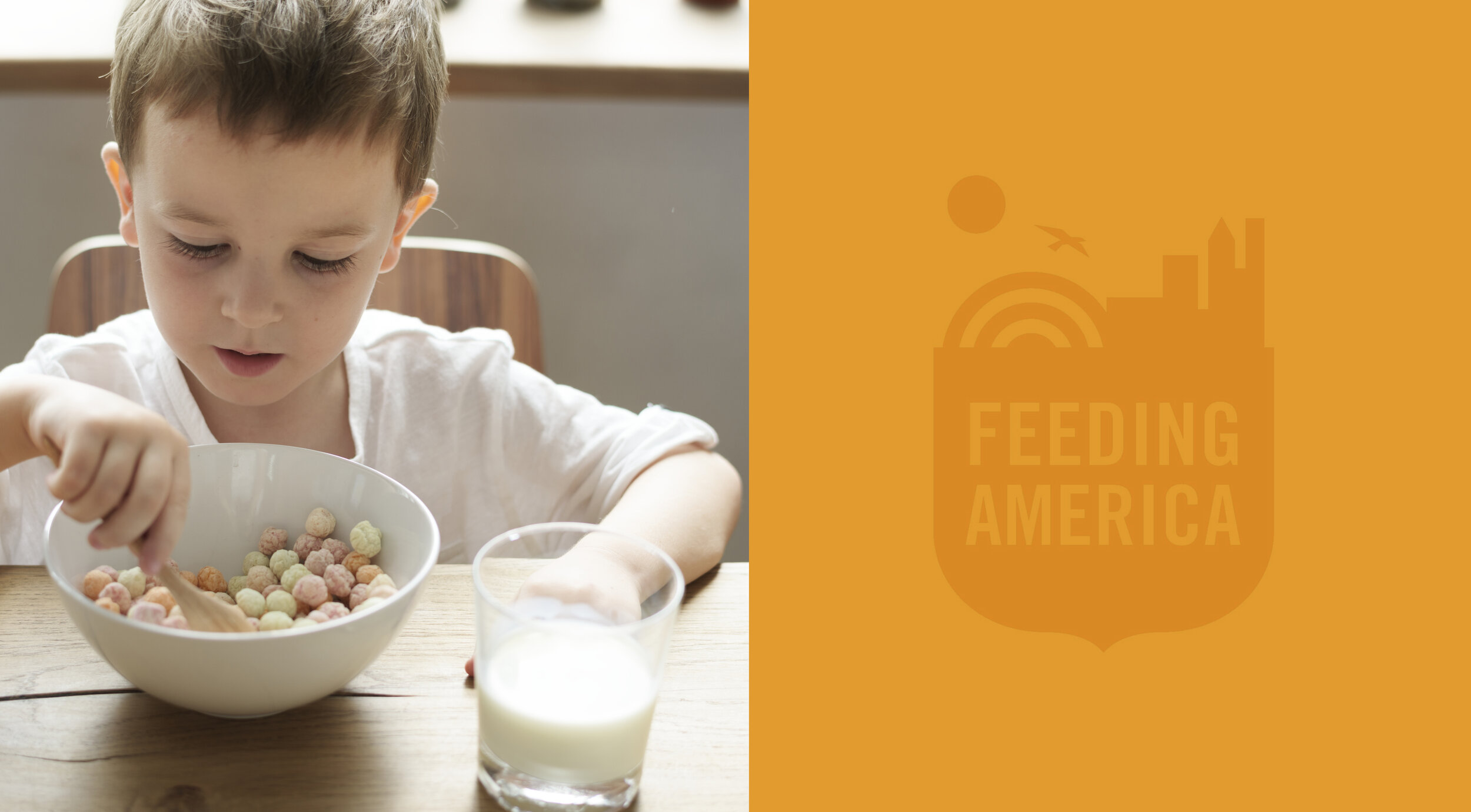
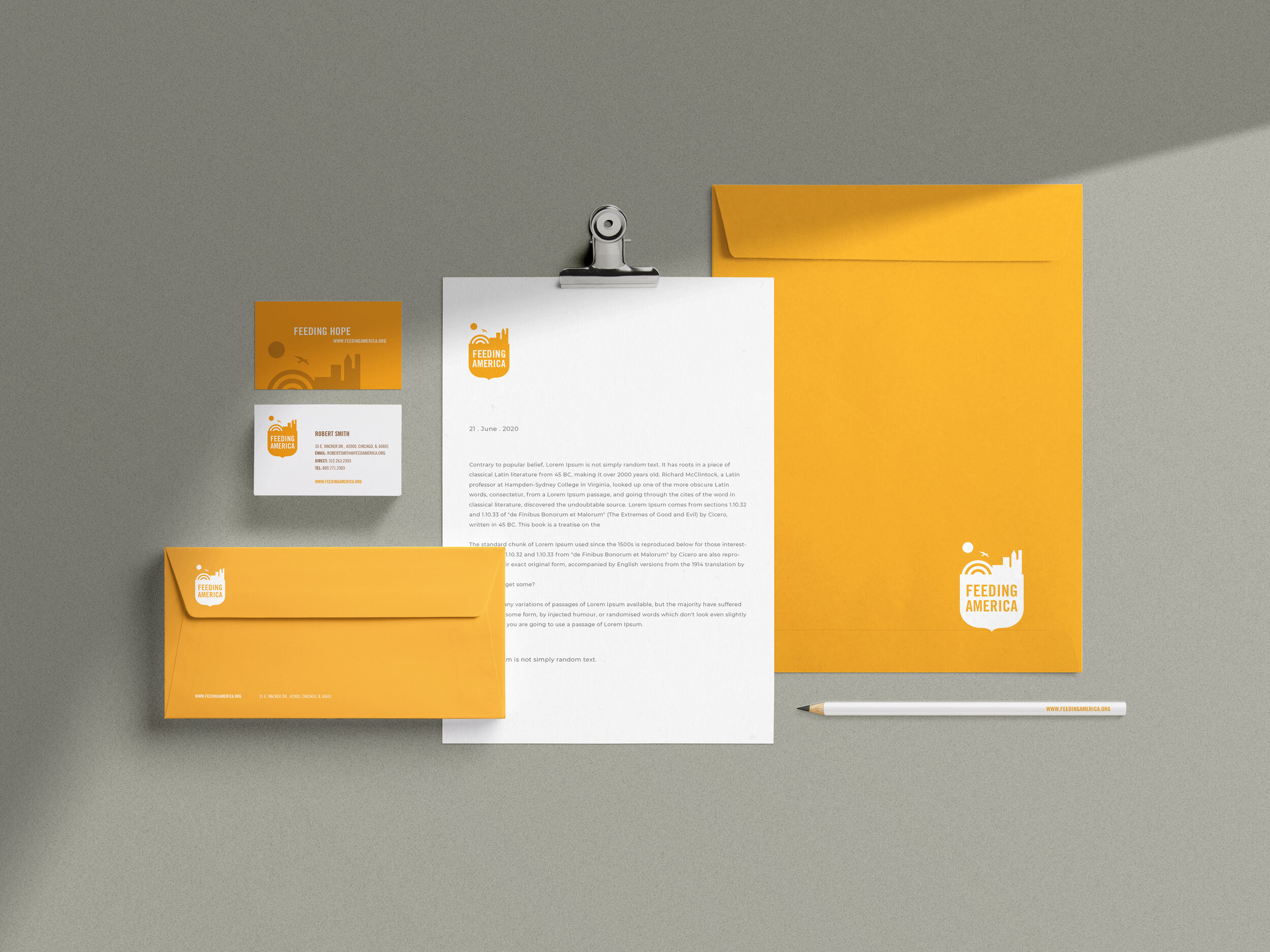
Exploration concepts